The Problem
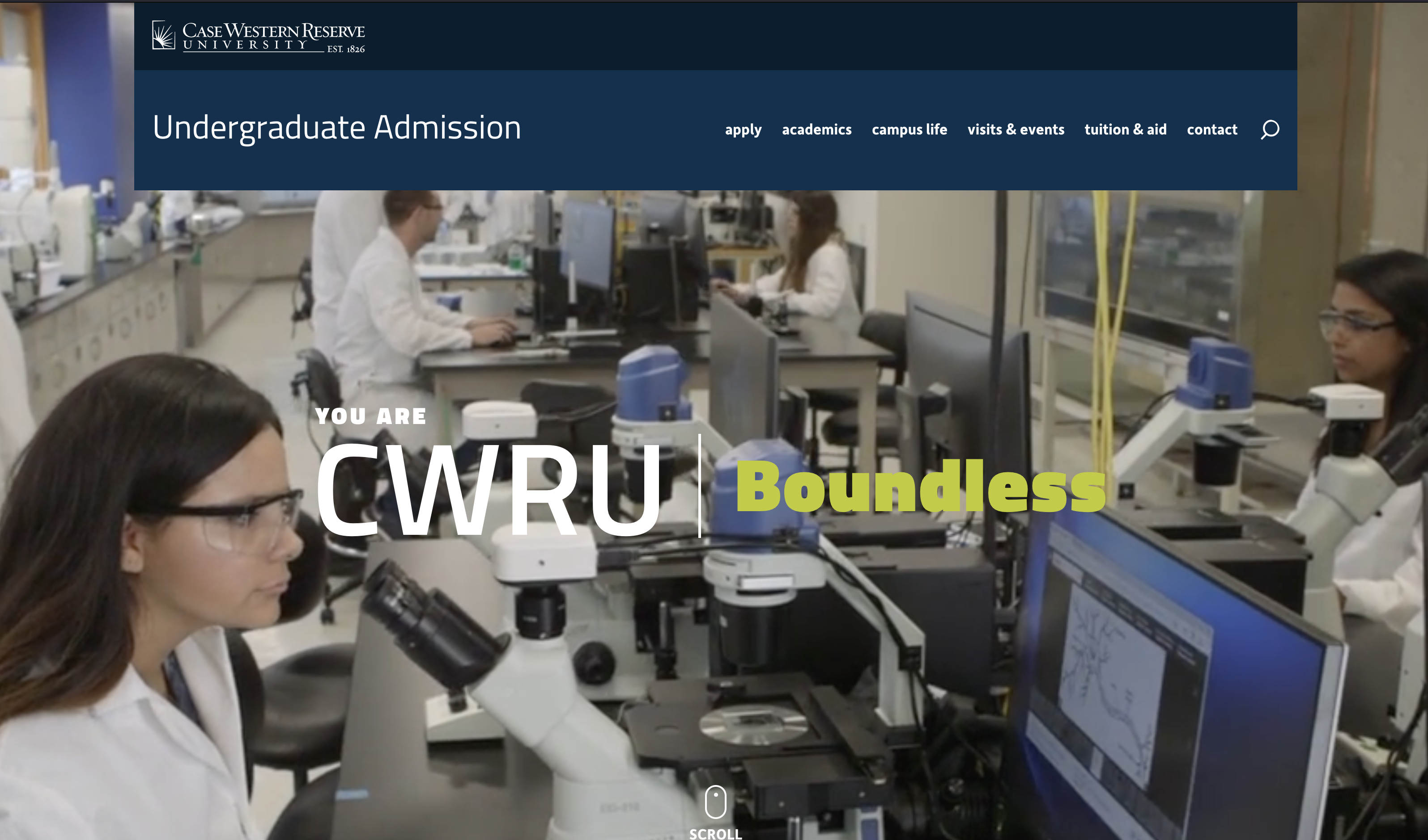
The Office of Undergraduate Admission requested a redesign of their website. The last time the website had been updated was in 2013, and the site wasn’t accessible or responsive. The stakeholders felt that their previous site didn’t adequately communicate what the university had to offer prospective students and students had trouble finding information on the site. They desired a more intuitive navigation, a fresh visual design and a better user experience.
The Solution
Through reviewing analytics, interviewing stakeholders/current student tour guides and testing the existing site, we were able to determine pain points with their previous site and identify the things that needed to be improved on the future site.
- Navigation should have clear intuitive labels
- Website should be vibrant and showcase student life
- Easily find and search academics
- Create a responsive/more engaging website
- Prioritize common tasks and make these easily accessible
- Address overall site goals and incorporate them into the new site
Get to know the users
We had a general idea of who the users for the Undergraduate website were as informed by the Undergraduate Admission office who had conducted some research on their own of their audiences.
In addition to that research, we performed a competitive review of other undergraduate admission websites. Usability testing was conducted on the current website and areas of concern were noted as users tried to complete common tasks on the website. Google analytics were also leveraged to find usage patterns, popular topics and frequent search terms to help us come up with personas for the site.
We interviewed key stakeholders and current student tour guides to get more information on who was utilizing the website. We paired that information with Google analytics to find usage patterns, popular topics and frequent search terms to help us come up with personas for the site (below is a summary of those personas).

Joe
Prospective Student
Joe is starting to explore his college options and is interested in going into engineering as well as chemistry. He wants to see what kind of programs are available at the university. While he knows that he has grades that are good enough to get into the university, he’s also interested in speaking with an admission officer to see how he can increase his chances of being accepted.

Priyanka
Parent
Priyanka has a daughter that is interested in attending CWRU but since they live out of state she’s unfamiliar with Cleveland. She’d like to learn more about the area as well as how safe it is. Lastly she knows that her daughter will need some kind of financial aid so she’s interested in seeing what the university offers.

Lia
International Student
Lia heard about Case Western Reserve University when an admission counselor visited her school. She thinks it would be a great opportunity to get her college education in the states. She’s interested in learning more about what campus life is like for students and also her ability to pursue and advanced degree after she graduates.
Information Architecture
The undergraduate admission website at the time had a very shallow architecture. We were able to categorize and relabel the navigation in a way that was intuitive for users to find the information they need.
We performed in person usability tests to make sure the architecture performed as intended.
Rewriting Content and Wireframing
With the amount of new pages/content that we were adding to this site, we knew that the content would need to be rewritten. This way we could ensure that the content was written for the web as well as be written in a way that was engaging to prospective students.
Since we were moving this content into the university’s content management system (CMS), Drupal, we needed to create content types for the various pages we were creating. To start the process we began with wireframes to have an idea of the content types and fields we’d need to create in the system. We also needed to figure out the functionality of the program sorter that was going to be used on the Academics landing page and wireframing this out helped us to plan for the tags we would need to include in the build.
Visual Design
Once the wireframes had been approved, we began the visual design of the website. One of the things that was expressed to us early on was to make sure we were able to visually engage and showcase the university. In this design we not only tried to bring out the personality of the university, but also our students by featuring words that students used to identify themselves (focused, gutsy, boundless, inquisitive & genuine).
We collaborated with a local photographer to capture our students on campus and in university circle to show what daily life might look like and brought these images into the site. Two of the larger design pieces we wanted to feature were an interactive map that had a photo gallery included and a grid of students that had animated photos to showcase their personalities.
Drupal Build & Content Import
The admission website brought on a new set of challenges for the web team. It was our first site to go live in Drupal 8 as well as the first site our team had ever built in Drupal. We had an aggressive timeline to meet as the department wanted the site to launch at the beginning of the school year so we spent a lot of time planning the build and how we wanted to syndicate content (which was part of the larger university Drupal build).
We ended up needing to create four different websites for this project, three of which were used to syndicate content across multiple websites. Those websites included Biographies, Programs, and Site Information which are used to share content across multiple websites using a product called Content Sync so editors only had to update this information in one place and it would update across all of the CWRU properties.
We also had to create and build the interactive map and determine what modules we wanted to use for the galleries, as well as making the entire website accessible.
Development and Quality Assurance
The development & content teams reviewed the site build to ensure that all of the pages and permissions have been added to the site. Editors also reviewed the site to ensure that the headers have been structured correctly, links are working and all images have proper alt tags to aid in accessibility.
Once the site has been approved for launch, we work with the University Technology team to schedule the go-live date. Once the site is live, all of the pages and redirects are double-checked to ensure they are working correctly.
